
one
Build AI powered websites with Astro, Shadcn and Vercel AI SDK
Stars: 58
ONE is a modern web and AI agent development toolkit that empowers developers to build AI-powered applications with high performance, beautiful UI, AI integration, responsive design, type safety, and great developer experience. It is perfect for building modern web applications, from simple landing pages to complex AI-powered platforms.
README:
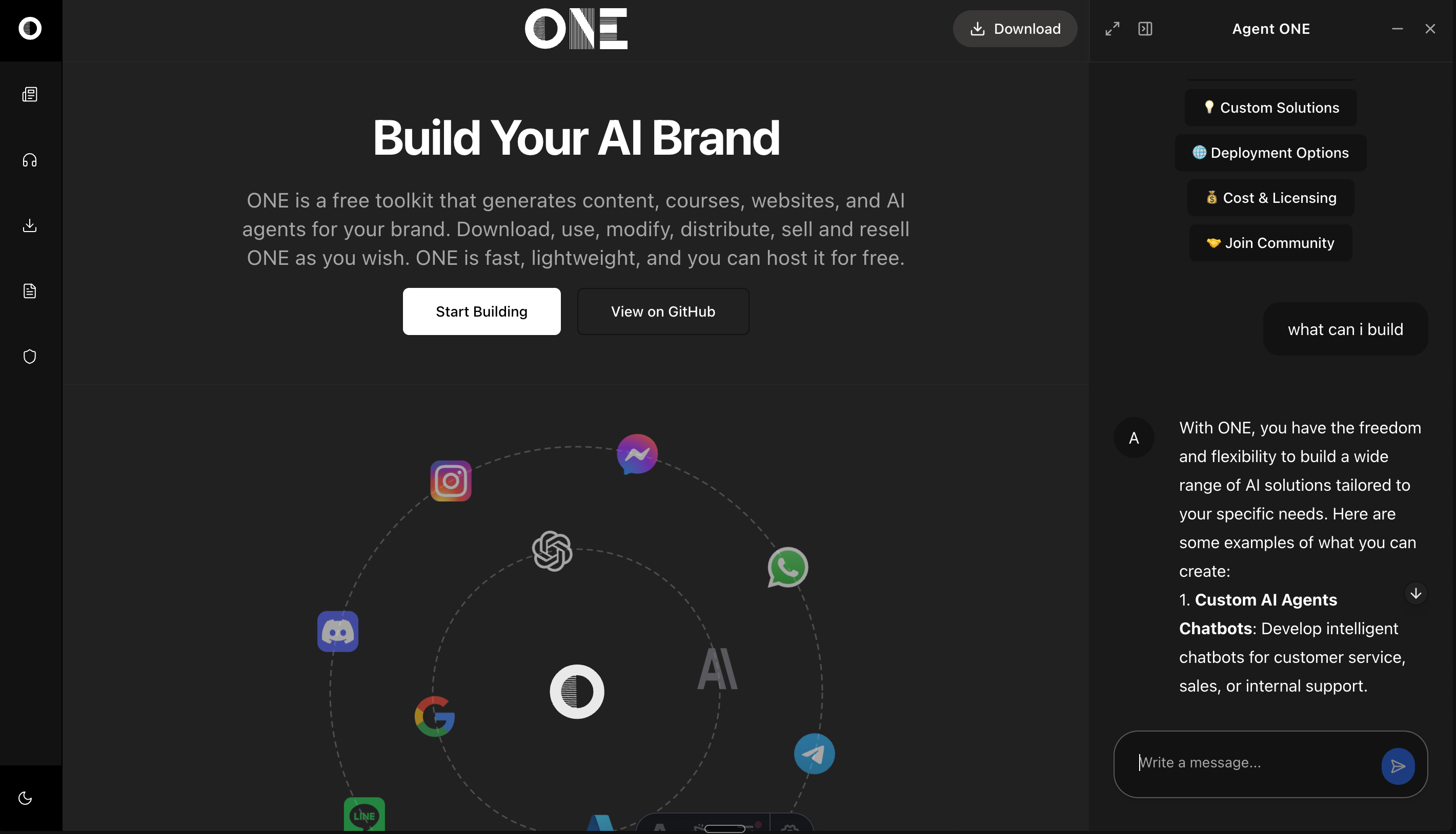
ONE is a modern web and AI agent development toolkit that combines the blazing-fast performance of Astro with the elegant components of Shadcn/UI. This enterprise-class starter kit empowers developers to build AI-powered applications with:
- ⚡ High Performance: Astro's partial hydration ensures minimal JavaScript
- 🎨 Beautiful UI: Pre-configured Shadcn components with full TypeScript support
- 🤖 AI Integration: Built-in tools for AI-powered features and automation
- 📱 Responsive Design: Mobile-first approach with Tailwind CSS
- 🔒 Type Safety: Full TypeScript support throughout the codebase
- 🛠️ Developer Experience: Hot reloading, intuitive project structure, and comprehensive documentation
Perfect for building modern web applications, from simple landing pages to complex AI-powered platforms.
This guide will help you set up and start building AI-powered applications with ONE. ONE combines Astro, React, and modern AI capabilities to create intelligent web applications.
Before you begin, ensure you have:
- Node.js 18 or higher installed
- pnpm package manager (
npm install -g pnpm) - An OpenAI API key (for AI capabilities)
- Basic knowledge of Astro and React
Choose your preferred way to get started with ONE:
📦 Option 1: Clone the Repository
git clone https://github.com/one-ie/one.git
cd one
💾 Option 2: Download ZIP
- Download the ZIP file: Download ONE
- Extract the contents
- Navigate to the project directory
🔄 Option 3: Fork the Repository
- Visit the Fork page
- Create your fork
- Clone your forked repository
Click the button above to instantly start developing in a cloud environment.
# Navigate to project directory
cd one

# Install dependencies
pnpm installMake a copy .env.example file in located at the top level of your project and call it .env
Add the keys to
OPENAI_API_KEY=your_api_key_herepnpm devVisit http://localhost:4321 to see your application running.
one/
├── src/
│   ├── components/     # UI components
│   ├── layouts/       # Page layouts
│   ├── pages/         # Routes and pages
│   ├── content/       # Markdown content
│   └── styles/        # Global styles
└── public/           # Static assets
- Create a new page (e.g.,
src/pages/chat.astro):
---
import Layout from "../layouts/Layout.astro";
import { ChatConfigSchema } from '../schema/chat';

const chatConfig = ChatConfigSchema.parse({
  systemPrompt: [{
    type: "text",
    text: "You are a helpful assistant."
  }],
  welcome: {
    message: "👋 How can I help you today?",
    avatar: "/icon.svg",
    suggestions: [
      {
        label: "Get Started",
        prompt: "How do I get started with ONE?"
      }
    ]
  }
});
---

<Layout
  title="Chat Page"
  chatConfig={chatConfig}
  rightPanelMode="quarter"
>
  <main>
    <h1>Welcome to the Chat</h1>
    <!-- Your page content here -->
  </main>
</Layout>const chatConfig = {
provider: "openai", // AI provider
model: "gpt-4o-mini", // Model to use
apiEndpoint: "https://api.openai.com/v1",
temperature: 0.7, // Response creativity (0-1)
maxTokens: 2000, // Maximum response length
systemPrompt: "...", // AI behavior definition
welcome: {
message: "...", // Welcome message
avatar: "/path/to/icon.svg",
suggestions: [...] // Quick start prompts
}
};The chat interface can be displayed in different modes:
-
quarter: 25% width side panel -
half: 50% width side panel -
full: Full screen chat -
floating: Floating chat window -
icon: Minimized chat button
Make your AI assistant knowledgeable about specific pages:
---
const pageContent = "Your page content here";

const chatConfig = ChatConfigSchema.parse({
  systemPrompt: [{
    type: "text",
    text: `You are an expert on ${pageContent}. Help users understand this content.`
  }],
  // ... other config options
});
---Customize the appearance using Tailwind CSS classes:
/* src/styles/global.css */
@tailwind base;
@tailwind components;
@tailwind utilities;

/* Your custom styles here */Adjust the layout using the Layout component props:
<Layout
  title="Your Page"
  description="Page description"
  header={true}        // Show/hide header
  footer={true}        // Show/hide footer
  rightPanelMode="quarter"
>
  <!-- Your content -->
</Layout>Enable or disable specific chat features:
const chatConfig = ChatConfigSchema.parse({
  // ... other options
  features: {
    textToSpeech: true,    // Enable voice synthesis
    codeHighlight: true,   // Enable code syntax highlighting
    markdown: true,        // Enable markdown rendering
    suggestions: true      // Enable quick suggestions
  }
});All Shadcn/UI components are pre-configured for Astro:
---
// Example usage in .astro file
import { Button } from "@/components/ui/button"
import { Card } from "@/components/ui/card"
---

<Button>Click me!</Button>- ✅ Accordion
- ✅ Alert Dialog
- ✅ Avatar
- ✅ Badge
- ✅ Button
- ✅ Card
- ✅ Dialog
- ... and more!
src/
├── components/                # UI Components
│   ├── ui/                   # Shadcn/UI components
│   ├── chat/                 # Chat-related components
│   └── magicui/              # Enhanced UI components
│
├── content/                  # Content Collections
│   ├── blog/                 # Blog posts
│   ├── docs/                 # Documentation
│   └── prompts/              # AI prompts
│
├── hooks/                    # React hooks
│   ├── use-mobile.tsx
│   ├── use-theme.ts
│   └── use-toast.ts
│
├── layouts/                  # Page layouts
│   ├── Blog.astro
│   ├── Docs.astro
│   ├── Layout.astro
│   └── LeftRight.astro
│
├── lib/                      # Utility functions
│   ├── utils.ts
│   └── icons.ts
│
├── pages/                    # Routes and pages
│   ├── api/                  # API endpoints
│   ├── blog/                 # Blog routes
│   ├── docs/                 # Documentation routes
│   └── index.astro          # Homepage
│
├── schema/                   # Data schemas
│   └── chat.ts              # Chat-related schemas
│
├── stores/                   # State management
│   └── layout.ts            # Layout state
│
├── styles/                   # Global styles
│   └── global.css           # Global CSS
│
└── types/                    # TypeScript types
    └── env.d.ts             # Environment types
-
Start Development
npm run dev
-
Using React Components in Astro
---
// Always add client:load for interactive components
import { Dialog } from "@/components/ui/dialog"
---

<Dialog client:load>
  <!-- Dialog content -->
</Dialog>
-
Build for Production
npm run build
npm run preview # Test the production build
✅ Component Hydration: All interactive components use client:load
✅ Build Warnings: Suppressed in configuration
✅ Path Aliases: Pre-configured for easy imports
✅ React Integration: Properly set up for Shadcn
-
Component Usage in Astro
---
// Always import in the frontmatter
import { Button } from "@/components/ui/button"
---

<!-- Use in template -->
<Button client:load>Click me!</Button>
-
Styling with Tailwind
<div class="dark:bg-slate-800">
  <Button class="m-4">Styled Button</Button>
</div>
-
Layout Usage
---
import Layout from '../layouts/Layout.astro';
---

<Layout title="Home">
  <!-- Your content -->
</Layout>
- Join Astro Discord
- Check Astro Documentation
- File an Issue on GitHub
Built with 🚀 Astro, 🎨 Shadcn/UI and Vercel AI SDK by ONE
For Tasks:
Click tags to check more tools for each tasksFor Jobs:
Alternative AI tools for one
Similar Open Source Tools
one
ONE is a modern web and AI agent development toolkit that empowers developers to build AI-powered applications with high performance, beautiful UI, AI integration, responsive design, type safety, and great developer experience. It is perfect for building modern web applications, from simple landing pages to complex AI-powered platforms.
AI-Agent-Starter-Kit
AI Agent Starter Kit is a modern full-stack AI-enabled template using Next.js for frontend and Express.js for backend, with Telegram and OpenAI integrations. It offers AI-assisted development, smart environment variable setup assistance, intelligent error resolution, context-aware code completion, and built-in debugging helpers. The kit provides a structured environment for developers to interact with AI tools seamlessly, enhancing the development process and productivity.
WebAI-to-API
This project implements a web API that offers a unified interface to Google Gemini and Claude 3. It provides a self-hosted, lightweight, and scalable solution for accessing these AI models through a streaming API. The API supports both Claude and Gemini models, allowing users to interact with them in real-time. The project includes a user-friendly web UI for configuration and documentation, making it easy to get started and explore the capabilities of the API.
simili-bot
Simili Bot is an AI-powered tool designed for GitHub repositories to automatically detect duplicate issues, find similar issues using semantic search, and intelligently route issues across repositories. It offers features such as semantic duplicate detection, cross-repository search, intelligent routing, smart triage, modular pipeline customization, and multi-repo support. The tool follows a 'Lego with Blueprints' architecture, with Lego Blocks representing independent pipeline steps and Blueprints providing pre-defined workflows. Users can configure AI providers like Gemini and OpenAI, set default models for embeddings, and specify workflows in a 'simili.yaml' file. Simili Bot also offers CLI commands for bulk indexing, processing single issues, and batch operations, enabling local development, testing, and analysis of historical data.
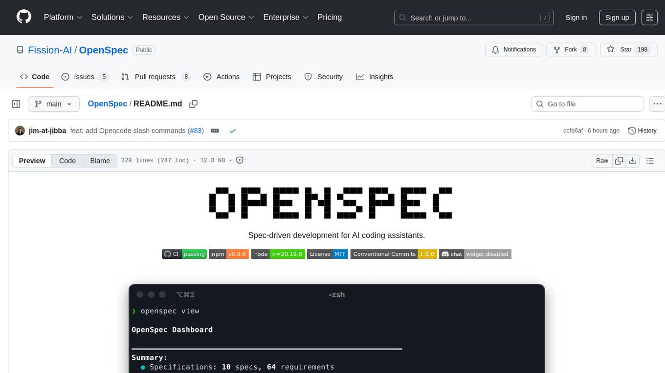
OpenSpec
OpenSpec is a tool for spec-driven development, aligning humans and AI coding assistants to agree on what to build before any code is written. It adds a lightweight specification workflow that ensures deterministic, reviewable outputs without the need for API keys. With OpenSpec, stakeholders can draft change proposals, review and align with AI assistants, implement tasks based on agreed specs, and archive completed changes for merging back into the source-of-truth specs. It works seamlessly with existing AI tools, offering shared visibility into proposed, active, or archived work.
kiss_ai
KISS AI is a lightweight and powerful multi-agent evolutionary framework that simplifies building AI agents. It uses native function calling for efficiency and accuracy, making building AI agents as straightforward as possible. The framework includes features like multi-agent orchestration, agent evolution and optimization, relentless coding agent for long-running tasks, output formatting, trajectory saving and visualization, GEPA for prompt optimization, KISSEvolve for algorithm discovery, self-evolving multi-agent, Docker integration, multiprocessing support, and support for various models from OpenAI, Anthropic, Gemini, Together AI, and OpenRouter.
Archon
Archon is an AI meta-agent designed to autonomously build, refine, and optimize other AI agents. It serves as a practical tool for developers and an educational framework showcasing the evolution of agentic systems. Through iterative development, Archon demonstrates the power of planning, feedback loops, and domain-specific knowledge in creating robust AI agents.
photo-ai
100xPhoto is a powerful AI image platform that enables users to generate stunning images and train custom AI models. It provides an intuitive interface for creating unique AI-generated artwork and training personalized models on image datasets. The platform is built with cutting-edge technology and offers robust capabilities for AI image generation and model training.

rlama
RLAMA is a powerful AI-driven question-answering tool that seamlessly integrates with local Ollama models. It enables users to create, manage, and interact with Retrieval-Augmented Generation (RAG) systems tailored to their documentation needs. RLAMA follows a clean architecture pattern with clear separation of concerns, focusing on lightweight and portable RAG capabilities with minimal dependencies. The tool processes documents, generates embeddings, stores RAG systems locally, and provides contextually-informed responses to user queries. Supported document formats include text, code, and various document types, with troubleshooting steps available for common issues like Ollama accessibility, text extraction problems, and relevance of answers.
vibe-remote
Vibe Remote is a tool that allows developers to code using AI agents through Slack or Discord, eliminating the need for a laptop or IDE. It provides a seamless experience for coding tasks, enabling users to interact with AI agents in real-time, delegate tasks, and monitor progress. The tool supports multiple coding agents, offers a setup wizard for easy installation, and ensures security by running locally on the user's machine. Vibe Remote enhances productivity by reducing context-switching and enabling parallel task execution within isolated workspaces.
Callytics
Callytics is an advanced call analytics solution that leverages speech recognition and large language models (LLMs) technologies to analyze phone conversations from customer service and call centers. By processing both the audio and text of each call, it provides insights such as sentiment analysis, topic detection, conflict detection, profanity word detection, and summary. These cutting-edge techniques help businesses optimize customer interactions, identify areas for improvement, and enhance overall service quality. When an audio file is placed in the .data/input directory, the entire pipeline automatically starts running, and the resulting data is inserted into the database. This is only a v1.1.0 version; many new features will be added, models will be fine-tuned or trained from scratch, and various optimization efforts will be applied.
mxcp
MXCP is an enterprise-grade MCP framework for building production-ready AI applications. It provides a structured methodology for data modeling, service design, smart implementation, quality assurance, and production operations. With built-in enterprise features like security, audit trail, type safety, testing framework, performance optimization, and drift detection, MXCP ensures comprehensive security, quality, and operations. The tool supports SQL for data queries and Python for complex logic, ML models, and integrations, allowing users to choose the right tool for each job while maintaining security and governance. MXCP's architecture includes LLM client, MXCP framework, implementations, security & policies, SQL endpoints, Python tools, type system, audit engine, validation & tests, data sources, and APIs. The tool enforces an organized project structure and offers CLI commands for initialization, quality assurance, data management, operations & monitoring, and LLM integration. MXCP is compatible with Claude Desktop, OpenAI-compatible tools, and custom integrations through the Model Context Protocol (MCP) specification. The tool is developed by RAW Labs for production data-to-AI workflows and is released under the Business Source License 1.1 (BSL), with commercial licensing required for certain production scenarios.
SG-Nav
SG-Nav is an online 3D scene graph prompting tool designed for LLM-based zero-shot object navigation. It proposes a framework that constructs an online 3D scene graph to prompt LLMs, allowing direct application to various scenes and categories without the need for training.
claudian
Claudian is an Obsidian plugin that embeds Claude Code as an AI collaborator in your vault. It provides full agentic capabilities, including file read/write, search, bash commands, and multi-step workflows. Users can leverage Claude Code's power to interact with their vault, analyze images, edit text inline, add custom instructions, create reusable prompt templates, extend capabilities with skills and agents, connect external tools via Model Context Protocol servers, control models and thinking budget, toggle plan mode, ensure security with permission modes and vault confinement, and interact with Chrome. The plugin requires Claude Code CLI, Obsidian v1.8.9+, Claude subscription/API or custom model provider, and desktop platforms (macOS, Linux, Windows).
connectonion
ConnectOnion is a simple, elegant open-source framework for production-ready AI agents. It provides a platform for creating and using AI agents with a focus on simplicity and efficiency. The framework allows users to easily add tools, debug agents, make them production-ready, and enable multi-agent capabilities. ConnectOnion offers a simple API, is production-ready with battle-tested models, and is open-source under the MIT license. It features a plugin system for adding reflection and reasoning capabilities, interactive debugging for easy troubleshooting, and no boilerplate code for seamless scaling from prototypes to production systems.
claude-code-settings
A repository collecting best practices for Claude Code settings and customization. It provides configuration files for customizing Claude Code's behavior and building an efficient development environment. The repository includes custom agents and skills for specific domains, interactive development workflow features, efficient development rules, and team workflow with Codex MCP. Users can leverage the provided configuration files and tools to enhance their development process and improve code quality.
For similar tasks
one
ONE is a modern web and AI agent development toolkit that empowers developers to build AI-powered applications with high performance, beautiful UI, AI integration, responsive design, type safety, and great developer experience. It is perfect for building modern web applications, from simple landing pages to complex AI-powered platforms.
pyqt-openai
VividNode is a cross-platform AI desktop chatbot application for LLM such as GPT, Claude, Gemini, Llama chatbot interaction and image generation. It offers customizable features, local chat history, and enhanced performance without requiring a browser. The application is powered by GPT4Free and allows users to interact with chatbots and generate images seamlessly. VividNode supports Windows, Mac, and Linux, securely stores chat history locally, and provides features like chat interface customization, image generation, focus and accessibility modes, and extensive customization options with keyboard shortcuts for efficient operations.
livehelperchat
Live Helper Chat is an open-source application that simplifies live support on websites, handling over 10,000 chats per day with multiple operators. It offers features like chat transcripts, multiple chats simultaneously, chat search, file uploads, and more. The tool supports integrations with various platforms like Agora, Jitsi, Rest API, and AI services such as Rasa AI and ChatGPT. It provides advanced functionalities like XMPP support, Chrome extension, work hours, screenshot feature, and chat statistics generation. Live Helper Chat ensures user privacy with no third-party cookies dependency and offers top performance with enabled cache. The tool is highly customizable with template and module override systems, support for custom extensions, and changeable footer and header content.
For similar jobs
promptflow
**Prompt flow** is a suite of development tools designed to streamline the end-to-end development cycle of LLM-based AI applications, from ideation, prototyping, testing, evaluation to production deployment and monitoring. It makes prompt engineering much easier and enables you to build LLM apps with production quality.
deepeval
DeepEval is a simple-to-use, open-source LLM evaluation framework specialized for unit testing LLM outputs. It incorporates various metrics such as G-Eval, hallucination, answer relevancy, RAGAS, etc., and runs locally on your machine for evaluation. It provides a wide range of ready-to-use evaluation metrics, allows for creating custom metrics, integrates with any CI/CD environment, and enables benchmarking LLMs on popular benchmarks. DeepEval is designed for evaluating RAG and fine-tuning applications, helping users optimize hyperparameters, prevent prompt drifting, and transition from OpenAI to hosting their own Llama2 with confidence.
MegaDetector
MegaDetector is an AI model that identifies animals, people, and vehicles in camera trap images (which also makes it useful for eliminating blank images). This model is trained on several million images from a variety of ecosystems. MegaDetector is just one of many tools that aims to make conservation biologists more efficient with AI. If you want to learn about other ways to use AI to accelerate camera trap workflows, check out our of the field, affectionately titled "Everything I know about machine learning and camera traps".
leapfrogai
LeapfrogAI is a self-hosted AI platform designed to be deployed in air-gapped resource-constrained environments. It brings sophisticated AI solutions to these environments by hosting all the necessary components of an AI stack, including vector databases, model backends, API, and UI. LeapfrogAI's API closely matches that of OpenAI, allowing tools built for OpenAI/ChatGPT to function seamlessly with a LeapfrogAI backend. It provides several backends for various use cases, including llama-cpp-python, whisper, text-embeddings, and vllm. LeapfrogAI leverages Chainguard's apko to harden base python images, ensuring the latest supported Python versions are used by the other components of the stack. The LeapfrogAI SDK provides a standard set of protobuffs and python utilities for implementing backends and gRPC. LeapfrogAI offers UI options for common use-cases like chat, summarization, and transcription. It can be deployed and run locally via UDS and Kubernetes, built out using Zarf packages. LeapfrogAI is supported by a community of users and contributors, including Defense Unicorns, Beast Code, Chainguard, Exovera, Hypergiant, Pulze, SOSi, United States Navy, United States Air Force, and United States Space Force.
llava-docker
This Docker image for LLaVA (Large Language and Vision Assistant) provides a convenient way to run LLaVA locally or on RunPod. LLaVA is a powerful AI tool that combines natural language processing and computer vision capabilities. With this Docker image, you can easily access LLaVA's functionalities for various tasks, including image captioning, visual question answering, text summarization, and more. The image comes pre-installed with LLaVA v1.2.0, Torch 2.1.2, xformers 0.0.23.post1, and other necessary dependencies. You can customize the model used by setting the MODEL environment variable. The image also includes a Jupyter Lab environment for interactive development and exploration. Overall, this Docker image offers a comprehensive and user-friendly platform for leveraging LLaVA's capabilities.

carrot
The 'carrot' repository on GitHub provides a list of free and user-friendly ChatGPT mirror sites for easy access. The repository includes sponsored sites offering various GPT models and services. Users can find and share sites, report errors, and access stable and recommended sites for ChatGPT usage. The repository also includes a detailed list of ChatGPT sites, their features, and accessibility options, making it a valuable resource for ChatGPT users seeking free and unlimited GPT services.
TrustLLM
TrustLLM is a comprehensive study of trustworthiness in LLMs, including principles for different dimensions of trustworthiness, established benchmark, evaluation, and analysis of trustworthiness for mainstream LLMs, and discussion of open challenges and future directions. Specifically, we first propose a set of principles for trustworthy LLMs that span eight different dimensions. Based on these principles, we further establish a benchmark across six dimensions including truthfulness, safety, fairness, robustness, privacy, and machine ethics. We then present a study evaluating 16 mainstream LLMs in TrustLLM, consisting of over 30 datasets. The document explains how to use the trustllm python package to help you assess the performance of your LLM in trustworthiness more quickly. For more details about TrustLLM, please refer to project website.
AI-YinMei
AI-YinMei is an AI virtual anchor Vtuber development tool (N card version). It supports fastgpt knowledge base chat dialogue, a complete set of solutions for LLM large language models: [fastgpt] + [one-api] + [Xinference], supports docking bilibili live broadcast barrage reply and entering live broadcast welcome speech, supports Microsoft edge-tts speech synthesis, supports Bert-VITS2 speech synthesis, supports GPT-SoVITS speech synthesis, supports expression control Vtuber Studio, supports painting stable-diffusion-webui output OBS live broadcast room, supports painting picture pornography public-NSFW-y-distinguish, supports search and image search service duckduckgo (requires magic Internet access), supports image search service Baidu image search (no magic Internet access), supports AI reply chat box [html plug-in], supports AI singing Auto-Convert-Music, supports playlist [html plug-in], supports dancing function, supports expression video playback, supports head touching action, supports gift smashing action, supports singing automatic start dancing function, chat and singing automatic cycle swing action, supports multi scene switching, background music switching, day and night automatic switching scene, supports open singing and painting, let AI automatically judge the content.