
aura-design
An open-source AI-friendly component library for next-generation intelligent applications.
Stars: 86
Aura Design is an open-source AI-friendly component library for next-generation intelligent applications. It offers AI-optimized interactive components designed for seamless integration with AI model I/O. The library works with various web frameworks and allows easy customization to suit specific requirements. With a modern design and smart markdown renderer, Aura Design enhances the overall user experience.
README:
An open-source AI-friendly component library for next-generation intelligent applications.
AM.
-
AI-First Design: AI-optimized interactive components (e.g., data visualization charts, NLP input fields, real-time feedback panels) designed for seamless integration with AI model I/O..
-
Universal Web Components: Works with React/Vue/Angular/Svelte and any web framework.
-
Customizable: Tailor the AI components to suit your specific requirements with easy customization options.
-
Modern Design: The components are designed with a modern and sleek interface, enhancing the overall user experience.
-
Smart Markdown Renderer: Extended markdown syntax with custom components support.
You can install the Aura Design Library via npm. Simply run the following command in your project directory:
npm install @aura-group/aura-design @aura-group/aura-design-proTo use the components from the Aura Design Library in your project, you can import them as follows:
// Aura Design Web Components
import {
    defineCustomElements,
    setupFontSymbol,
    Icon,
    Button,
    Card,
    ChatBubble,
    FlexBox,
    LayoutGrid,
    Textarea,
    Textfield,
} from '@aura-group/aura-design';
// Setup icon symbol
setupFontSymbol()
// Define the component which you need
// Use defineCustomElements() will define all the components
defineCustomElements({
    Icon,
    Button,
    Card,
    ChatBubble,
    FlexBox,
    LayoutGrid,
    Textarea,
    Textfield,
});

// Aura Design Pro Web Components
import { defineCustomElements as defineCustomElementsPro } from '@aura-group/aura-design-pro';
defineCustomElementsPro()

// Theme and style
import '@aura-group/aura-design/dist/style.css'For detailed documentation on each component and their props, please refer to the official documentation.
We welcome contributions to the Aura Design Library! If you have any ideas, bug fixes, or improvements, feel free to open an issue or submit a pull request on our GitHub repository.
For Tasks:
Click tags to check more tools for each tasksFor Jobs:
Alternative AI tools for aura-design
Similar Open Source Tools
aura-design
Aura Design is an open-source AI-friendly component library for next-generation intelligent applications. It offers AI-optimized interactive components designed for seamless integration with AI model I/O. The library works with various web frameworks and allows easy customization to suit specific requirements. With a modern design and smart markdown renderer, Aura Design enhances the overall user experience.
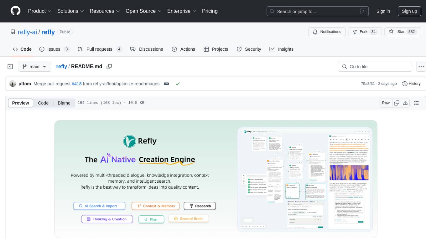
refly
Refly.AI is an open-source AI-native creation engine that empowers users to transform ideas into production-ready content. It features a free-form canvas interface with multi-threaded conversations, knowledge base integration, contextual memory, intelligent search, WYSIWYG AI editor, and more. Users can leverage AI-powered capabilities, context memory, knowledge base integration, quotes, and AI document editing to enhance their content creation process. Refly offers both cloud and self-hosting options, making it suitable for individuals, enterprises, and organizations. The tool is designed to facilitate human-AI collaboration and streamline content creation workflows.
genkit
Firebase Genkit (beta) is a framework with powerful tooling to help app developers build, test, deploy, and monitor AI-powered features with confidence. Genkit is cloud optimized and code-centric, integrating with many services that have free tiers to get started. It provides unified API for generation, context-aware AI features, evaluation of AI workflow, extensibility with plugins, easy deployment to Firebase or Google Cloud, observability and monitoring with OpenTelemetry, and a developer UI for prototyping and testing AI features locally. Genkit works seamlessly with Firebase or Google Cloud projects through official plugins and templates.
Genkit
Genkit is an open-source framework for building full-stack AI-powered applications, used in production by Google's Firebase. It provides SDKs for JavaScript/TypeScript (Stable), Go (Beta), and Python (Alpha) with unified interface for integrating AI models from providers like Google, OpenAI, Anthropic, Ollama. Rapidly build chatbots, automations, and recommendation systems using streamlined APIs for multimodal content, structured outputs, tool calling, and agentic workflows. Genkit simplifies AI integration with open-source SDK, unified APIs, and offers text and image generation, structured data generation, tool calling, prompt templating, persisted chat interfaces, AI workflows, and AI-powered data retrieval (RAG).
goose
Codename Goose is an open-source, extensible AI agent designed to provide functionalities beyond code suggestions. Users can install, execute, edit, and test with any LLM. The tool aims to enhance the coding experience by offering advanced features and capabilities. Stay updated for the upcoming 1.0 release scheduled by the end of January 2025. Explore the v0.X documentation available on the project's GitHub pages.
llmariner
LLMariner is an extensible open source platform built on Kubernetes to simplify the management of generative AI workloads. It enables efficient handling of training and inference data within clusters, with OpenAI-compatible APIs for seamless integration with a wide range of AI-driven applications.
bedrock-engineer
Bedrock Engineer is an AI assistant for software development tasks powered by Amazon Bedrock. It combines large language models with file system operations and web search functionality to support development processes. The autonomous AI agent provides interactive chat, file system operations, web search, project structure management, code analysis, code generation, data analysis, agent and tool customization, chat history management, and multi-language support. Users can select agents, customize them, select tools, and customize tools. The tool also includes a website generator for React.js, Vue.js, Svelte.js, and Vanilla.js, with support for inline styling, Tailwind.css, and Material UI. Users can connect to design system data sources and generate AWS Step Functions ASL definitions.
enthusiast
Enthusiast is a production-ready agentic AI framework for E-commerce, offering tools like Retrieval-Argumented Generation (RAG), vector search, and workflow orchestrator. It helps in building AI-powered tools with customized agents for tasks like smart information search, customer support, content generation, and knowledge base automation. Enthusiast provides validation and evaluation components to ensure responses are grounded in actual data, reducing time, cost, and complexity in AI development.
LazyLLM
LazyLLM is a low-code development tool for building complex AI applications with multiple agents. It assists developers in building AI applications at a low cost and continuously optimizing their performance. The tool provides a convenient workflow for application development and offers standard processes and tools for various stages of application development. Users can quickly prototype applications with LazyLLM, analyze bad cases with scenario task data, and iteratively optimize key components to enhance the overall application performance. LazyLLM aims to simplify the AI application development process and provide flexibility for both beginners and experts to create high-quality applications.
miyagi
Project Miyagi showcases Microsoft's Copilot Stack in an envisioning workshop aimed at designing, developing, and deploying enterprise-grade intelligent apps. By exploring both generative and traditional ML use cases, Miyagi offers an experiential approach to developing AI-infused product experiences that enhance productivity and enable hyper-personalization. Additionally, the workshop introduces traditional software engineers to emerging design patterns in prompt engineering, such as chain-of-thought and retrieval-augmentation, as well as to techniques like vectorization for long-term memory, fine-tuning of OSS models, agent-like orchestration, and plugins or tools for augmenting and grounding LLMs.
ClicShopping_V3
ClicShoppingAI is a powerful open-source Ecommerce solution that supports B2B, B2C, and B2B-B2C. Integrated with cutting-edge generative artificial intelligence systems like Gpt and Ollama, it helps merchants increase turnover and competitiveness for free. With AI capabilities, it optimizes inventory, offers personalized recommendations, and provides top-notch customer service. The solution is modular, lightweight, and user-friendly, with a seamless, responsive design for all devices. Installation is easy, empowering ongoing development through community support. Features include GPT API integration, generative AI functionalities, real-time safety stock predictive, WYSIWYG product description creation, image editor management, full SEO optimization, payment and shipping modules, extension system, GDPR compliance, multi-language support, and more.
ClicShopping
ClicShopping AI™ is an open-source Ecommerce platform powered by Generative AI, designed for B2B, B2C, and B2B-B2C businesses. It offers seamless shopping experiences, advanced AI integration, modular architecture for customization, and responsive design across devices. With features like GPT API integration, RAG-powered Business Intelligence Agent, multi-model AI support, and security compliance, ClicShopping AI™ is a comprehensive solution for online businesses. It also provides internationalization support, performance analytics, server performance optimization, content management, API connections, shipping and payment options, and a marketplace for additional modules and apps.
prism
Prism is a Laravel package that simplifies the integration of Large Language Models (LLMs) into applications. It offers a user-friendly interface for text generation, managing multi-step conversations, and leveraging AI tools from different providers. With Prism, developers can focus on creating exceptional AI applications without being bogged down by technical complexities.
gradient-cli
Gradient CLI is a tool designed to facilitate the end-to-end MLOps process, allowing individuals and organizations to develop, train, and deploy Deep Learning models efficiently. It supports various ML/DL frameworks and provides features such as 1-click Jupyter Notebooks, scalable model training workflows, and model deployment as API endpoints. The tool can run on different infrastructures like AWS, GCP, on-premise, and Paperspace GPUs, offering automatic versioning, distributed training, hyperparameter search, and more.
prism
Prism is a Laravel package for integrating Large Language Models (LLMs) into applications. It simplifies text generation, multi-step conversations, and AI tools integration. Focus on developing exceptional AI applications without technical complexities.
For similar tasks
aura-design
Aura Design is an open-source AI-friendly component library for next-generation intelligent applications. It offers AI-optimized interactive components designed for seamless integration with AI model I/O. The library works with various web frameworks and allows easy customization to suit specific requirements. With a modern design and smart markdown renderer, Aura Design enhances the overall user experience.
auto-dev
AutoDev Xiuper is an AI-native, multi-agent development platform built on Kotlin Multiplatform. It covers all seven phases of the software development lifecycle and runs on 8+ platforms. The platform provides a unified architecture for writing code once and running it anywhere, with specialized agents for each phase of development. It supports various devices including IntelliJ IDEA, VS Code, CLI, Web, Desktop, Android, iOS, and Server. The platform also offers features like Multi-LLM support, DevIns language for workflow automation, MCP Protocol for extensible tool ecosystem, and code intelligence for multiple programming languages.
dewhale
Dewhale is a GitHub-Powered AI tool designed for effortless development. It utilizes prompt engineering techniques under the GPT-4 model to issue commands, allowing users to generate code with lower usage costs and easy customization. The tool seamlessly integrates with GitHub, providing version control, code review, and collaborative features. Users can join discussions on the design philosophy of Dewhale and explore detailed instructions and examples for setting up and using the tool.
cedar-OS
Cedar OS is an open-source framework that bridges the gap between AI agents and React applications, enabling the creation of AI-native applications where agents can interact with the application state like users. It focuses on providing intuitive and powerful ways for humans to interact with AI through features like full state integration, real-time streaming, voice-first design, and flexible architecture. Cedar OS offers production-ready chat components, agentic state management, context-aware mentions, voice integration, spells & quick actions, and fully customizable UI. It differentiates itself by offering a true AI-native architecture, developer-first experience, production-ready features, and extensibility. Built with TypeScript support, Cedar OS is designed for developers working on ambitious AI-native applications.
tool-ui
Tool UI is a collection of UI components designed for AI interfaces. It provides responsive, accessible, and copy-pasteable components built on Radix, shadcn/ui, and Tailwind. The repository offers a variety of components such as Approval Card, Audio, Chart, Citation, Code Block, Data Table, Image, Image Gallery, and more. Tool UI is maintained by assistant-ui and optimized for direct maintenance rather than open-ended external contributions.
generative-ai-dart
The Google Generative AI SDK for Dart enables developers to utilize cutting-edge Large Language Models (LLMs) for creating language applications. It provides access to the Gemini API for generating content using state-of-the-art models. Developers can integrate the SDK into their Dart or Flutter applications to leverage powerful AI capabilities. It is recommended to use the SDK for server-side API calls to ensure the security of API keys and protect against potential key exposure in mobile or web apps.
SemanticKernel.Assistants
This repository contains an assistant proposal for the Semantic Kernel, allowing the usage of assistants without relying on OpenAI Assistant APIs. It runs locally planners and plugins for the assistants, providing scenarios like Assistant with Semantic Kernel plugins, Multi-Assistant conversation, and AutoGen conversation. The Semantic Kernel is a lightweight SDK enabling integration of AI Large Language Models with conventional programming languages, offering functions like semantic functions, native functions, and embeddings-based memory. Users can bring their own model for the assistants and host them locally. The repository includes installation instructions, usage examples, and information on creating new conversation threads with the assistant.
ezlocalai
ezlocalai is an artificial intelligence server that simplifies running multimodal AI models locally. It handles model downloading and server configuration based on hardware specs. It offers OpenAI Style endpoints for integration, voice cloning, text-to-speech, voice-to-text, and offline image generation. Users can modify environment variables for customization. Supports NVIDIA GPU and CPU setups. Provides demo UI and workflow visualization for easy usage.
For similar jobs
sweep
Sweep is an AI junior developer that turns bugs and feature requests into code changes. It automatically handles developer experience improvements like adding type hints and improving test coverage.
teams-ai
The Teams AI Library is a software development kit (SDK) that helps developers create bots that can interact with Teams and Microsoft 365 applications. It is built on top of the Bot Framework SDK and simplifies the process of developing bots that interact with Teams' artificial intelligence capabilities. The SDK is available for JavaScript/TypeScript, .NET, and Python.
ai-guide
This guide is dedicated to Large Language Models (LLMs) that you can run on your home computer. It assumes your PC is a lower-end, non-gaming setup.
classifai
Supercharge WordPress Content Workflows and Engagement with Artificial Intelligence. Tap into leading cloud-based services like OpenAI, Microsoft Azure AI, Google Gemini and IBM Watson to augment your WordPress-powered websites. Publish content faster while improving SEO performance and increasing audience engagement. ClassifAI integrates Artificial Intelligence and Machine Learning technologies to lighten your workload and eliminate tedious tasks, giving you more time to create original content that matters.
chatbot-ui
Chatbot UI is an open-source AI chat app that allows users to create and deploy their own AI chatbots. It is easy to use and can be customized to fit any need. Chatbot UI is perfect for businesses, developers, and anyone who wants to create a chatbot.
BricksLLM
BricksLLM is a cloud native AI gateway written in Go. Currently, it provides native support for OpenAI, Anthropic, Azure OpenAI and vLLM. BricksLLM aims to provide enterprise level infrastructure that can power any LLM production use cases. Here are some use cases for BricksLLM: * Set LLM usage limits for users on different pricing tiers * Track LLM usage on a per user and per organization basis * Block or redact requests containing PIIs * Improve LLM reliability with failovers, retries and caching * Distribute API keys with rate limits and cost limits for internal development/production use cases * Distribute API keys with rate limits and cost limits for students
uAgents
uAgents is a Python library developed by Fetch.ai that allows for the creation of autonomous AI agents. These agents can perform various tasks on a schedule or take action on various events. uAgents are easy to create and manage, and they are connected to a fast-growing network of other uAgents. They are also secure, with cryptographically secured messages and wallets.
griptape
Griptape is a modular Python framework for building AI-powered applications that securely connect to your enterprise data and APIs. It offers developers the ability to maintain control and flexibility at every step. Griptape's core components include Structures (Agents, Pipelines, and Workflows), Tasks, Tools, Memory (Conversation Memory, Task Memory, and Meta Memory), Drivers (Prompt and Embedding Drivers, Vector Store Drivers, Image Generation Drivers, Image Query Drivers, SQL Drivers, Web Scraper Drivers, and Conversation Memory Drivers), Engines (Query Engines, Extraction Engines, Summary Engines, Image Generation Engines, and Image Query Engines), and additional components (Rulesets, Loaders, Artifacts, Chunkers, and Tokenizers). Griptape enables developers to create AI-powered applications with ease and efficiency.