
nb_utils
Collection of Widgets and helpful Methods that every developer needs.
Stars: 148
nb_utils is a Flutter package that provides a collection of useful methods, extensions, widgets, and utilities to simplify Flutter app development. It includes features like shared preferences, text styles, decorations, widgets, extensions for strings, colors, build context, date time, device, numbers, lists, scroll controllers, system methods, network utils, JWT decoding, and custom dialogs. The package aims to enhance productivity and streamline common tasks in Flutter development.
README:
| Android | iOS | MacOS | Web | Linux | Windows |
|---|---|---|---|---|---|
| ✔️ | ✔️ | ✔️ | ✔️ | ✔️ | ✔️ |
Add this package to pubspec.yaml as follows:
$ flutter pub add nb_utilsImport package
import 'package:nb_utils/nb_utils.dart';Initialize nb_utils in main.dart file for initializing Shared Preferences and other variables. Also you can assign your Chat GPT key here.
void main() async {
  WidgetsFlutterBinding.ensureInitialized();

  await initialize();

  chatGPTAPIkey = "YOUR_KEY";

  runApp(MyApp());
}
Now, add navigatorKey in your MaterialApp or CupertinoApp
return MaterialApp(
  debugShowCheckedModeBanner: false,
  navigatorKey: navigatorKey,
  home: HomePage(),
);- Useful Methods
- Use of TextStyle
- Shared Preference Example
- MaterialYou Theme
- Decorations
- Widgets
- Extensions
- System Methods
- Network Utils
- JWT Decoder
- Dialog
- Custom Dialogs
/// Open a new screen
HomePage().launch(context);

/// Animate the new page (Slide, Rotate, Scale, Fade)
HomePage().launch(context, pageRouteAnimation: PageRouteAnimation.Slide);

/// Remove all screens from back stack and opens new screen
HomePage().launch(context, isNewTask: true);

// Returns to previous Screen
finish(context);

// Returns to previous Screen with a result
finish(context, object);

/// Toast a String
toast('This is a string');

/// Prints only if in debug or profile mode - (parameter is Object)
log('Your string');

void hideKeyboard(context)

/// If you are opening Dialog in initState method and you want to use BuildContext but yet it is not created,
/// You can use afterBuildLayout in initState method like this.
afterBuildLayout(() {
  // Get Callback after your build widget is rendered
});

/// Get Package Name from Native Platform (Android, iOS)
await getPackageName();

/// Get Package Name, Version Code, Version Name (Android, iOS)
await getPackageInfo();

/// Return true if Android OS version is above 12
Future<bool> isAndroid12Above()

///  Handle error and loading widget when using FutureBuilder or StreamBuilder
/// "snap" is the snapShot value we get from FutureBuilder or StreamBuilder
return snapWidgetHelper(snap);

/// See the example below. You can Use FutureBuilder or StreamBuilder.
FutureBuilder(
  builder(_, snap) {
    if (snap.hasData) {
      return YourWidget();
    } else {
      /// This function will handle loading and error automatically.
      /// You can modify loading and error widget in parameters.

      return snapWidgetHelper(snap);
    }
  }
),

// Basic SnackBar
snackBar(context, title: 'Sample toast'),

// Enhanced
snackBar(
  context,
  title: 'Sample toast',
  textColor: Colors.blue,
  backgroundColor: Colors.white,
  elevation: 8,
  shape: RoundedRectangleBorder(borderRadius: radius(30)),
  margin: EdgeInsets.all(16),
  duration: 3.seconds,
);/// Apply Bold TextStyle
Text(item.title.validate(), style: boldTextStyle()),
/// Apply Primary TextStyle
Text(item.title.validate(), style: primaryTextStyle()),
/// Apply Secondary TextStyle
Text(item.title.validate(), style: secondaryTextStyle()),/// To use SharedPreference, you must call initialize() method in main.dart file as mentioned in Installations section
/// setValue method has (String key, dynamic value) parameters
/// add a Double in SharedPref
await setValue("key", 20.0);
/// add a bool in SharedPref
await setValue("key", false);
/// add a int in SharedPref
await setValue("key", 10);
/// add a String in SharedPref
await setValue("key", "value");
/// add a String List in SharedPref
await setValue("key", ['value', 'value', 'value']);
/// Returns a Bool if exists in SharedPref
/// You can set a default value if it returns null
getBoolAsync("key");
/// Returns a Double if exists in SharedPref
getDoubleAsync("key");
/// Returns a Int if exists in SharedPref
getIntAsync("key");
/// Returns a String if exists in SharedPref
getStringAsync("key");
/// Returns a JSON if exists in SharedPref
getJSONAsync("key");
/// Remove a key from SharedPref
await removeKey("key");
/// Returns List of Keys that matches with given Key
getMatchingSharedPrefKeys('key')Future<dynamic> getMaterialYouColors()
Future<Color> getMaterialYouPrimaryColor()BorderRadius radius([double? radius])
Radius radiusCircular([double? radius])
BorderRadius radiusOnly({double? topRight,double? topLeft,double? bottomRight,double? bottomLeft,})
ShapeBorder dialogShape([double? borderRadius])
/// Apply default BoxDecoration with default shadow and border radius
Container(
decoration: boxDecorationDefault(), // You can modify based on your preference
),
InputDecoration defaultInputDecoration({String? hint, String? label, TextStyle? textStyle})/// Give Blur effect to any widget
/// Use Blur widget to know more properies
Blur(
child: AnyWidget(),
)/// Making an app for Web? You must have to perform something on mouse hover event.
/// Use HoverWidget to get your widget is being hovering or not
HoverWidget(
builder: (_, isHovering) {
return AnyWidget();
},
),/// Wrap MaterialApp Widget with RestartAppWidget
/// Use: RestartAppWidget.init(context);
/// Call above line any where to restart your Flutter app.
RestartAppWidget(
child: MaterialApp(),
)DoublePressBackWidget(
child: AnyWidget(),
message: 'Your message' // Optional
),/// Add a Google Logo
/// Add size parameter for custom size - Default is 24
GoogleLogoWidget(),/// You can use your preferred State Management technique
Loader().visible(mIsLoading),/// Read More Text Widget
/// Use ReadMoreText Widget in your project to get more familiar with other properties
ReadMoreText(
'Long Text',
),/// Timer widget
TimerWidget(
function: () {
// Do something
},
child: Text('Your Widget'),
duration: 10.seconds,
),SettingSection(
title: Text('Account Management', style: boldTextStyle(size: 24)),
subTitle: Text('Control your account', style: primaryTextStyle()), // Optional
items: [
SettingItemWidget(
title: 'Hibernate account',
subTitle: 'Temporary deactivate your account',
decoration: BoxDecoration(borderRadius: radius()),
trailing: Icon(Icons.keyboard_arrow_right_rounded, color: context.dividerColor),
onTap: () {
//
}
),
SettingItemWidget(
title: 'Close account',
subTitle: 'Learn about your options, and close your account if you wish',
decoration: BoxDecoration(borderRadius: radius()),
trailing: Icon(Icons.keyboard_arrow_right_rounded, color: context.dividerColor),
onTap: () {
//
},
)
],
),//SettingItem
SettingItemWidget(
title: "Title",
onTap: () {
//Your Logic
},
trailing: Icon(Icons.home_sharp), // Optional
leading: Icon(Icons.arrow_forward_ios_rounded), // Optional
subTitle: "Subtitle", // Optional
),/// Default AppButton
/// Use AppButton on your app to try more properties
AppButton(
text: "Submit",
color: Colors.green, // Optional
onTap: () {
//Your logic
},
),/// Use PlaceHolderWidget while your network image is loading
PlaceHolderWidget(),/// Use GradientBorder while your network image is loading
GradientBorder(
gradient: LinearGradient(
colors: [
Colors.orange,
Colors.yellow,
Colors.pink,
],
),
strokeWidth: 4.0,
child: AnyWidget(),
)/// Use RoundedCheckBox widget to get nicely rounded check box
/// It has many optional parameters to get personalized check box widget
RoundedCheckBox(
isChecked: true,
text: 'Remember me',
onTap: (val) {
//
},
),/// Use SizeListener widget to get callback when its child widget size changes
SizeListener(
child: AnyWidget(),
onSizeChange: (size) {
log(size.width.toString());
},
),UL(
symbolType: SymbolType.Numbered,
children: [
Text('Hi', style: primaryTextStyle()),
Text('Hello', style: primaryTextStyle()),
Text('How are you?', style: primaryTextStyle()),
],
),/// Use AppTextField on your app to try more properties
/// Use Form Validate to validate all AppTextField
/// Inbuilt Email Validator, Automatic email keyboard type
AppTextField(
controller: TextEditingController(), // Optional
textFieldType: TextFieldType.EMAIL,
decoration: InputDecoration(labelText: 'Email', border: OutlineInputBorder()),
),
/// Default Min Lines 4
AppTextField(
controller: TextEditingController(), // Optional
textFieldType: TextFieldType.MULTILINE,
decoration: InputDecoration(labelText: 'Address', border: OutlineInputBorder()),
),
/// Automatic password obscure, Show/Hide Password Option
AppTextField(
controller: TextEditingController(), // Optional
textFieldType: TextFieldType.PASSWORD,
decoration: InputDecoration(labelText: 'Password', border: OutlineInputBorder()),
),/// Add read more button to a long text
ReadMoreText(
'Long Text',
),/// Build Horizontal List widget without giving specific height to it.
HorizontalList(
itemBuilder: (BuildContext context, int index) {
return AnyWidget();
},
itemCount: 25,
),RatingBarWidget(
rating: initialRating,
onRatingChanged: (aRating) {
rating = aRating;
},
),/// Make your Flutter App Responsive in any device out there with Responsive widget
Responsive(
mobile: MobileWidget(),
tablet: TabletWidget(), // Optional
web: WebWidget(), // Optional
),TextIcon(
text: 'Your text',
prefix: AnyWidget(), // Optional
suffix: AnyWidget(), // Optional
),DotIndicator(
pageController: pageController,
pages: list,
),/// Use SnapHelperWidget to handle loading and error widget automatically
/// Still you can specify custom Loader Widget and Error Widget
SnapHelperWidget<T>(
future: future,
onSuccess: (data) {
return AnyWidget();
},
),DottedBorderWidget(
child: Container(
height: 100,
width: 100,
),
),Marquee(
direction: Axis.horizontal,
animationDuration: Duration(milliseconds: 100),
pauseDuration: Duration(milliseconds: 100),
child: Text("Please enter a long text to see the effect of the marquee widget"),
),String validate({String value = ''})
bool validateEmail()
bool validatePhone()
bool validateURL()
bool isDigit()
bool isAlpha()
bool isJson()
bool get isInt
bool get isImage
bool get isAudio
bool get isVideo
bool get isTxt
bool get isDoc
bool get isExcel
bool get isPPT
bool get isApk
bool get isPdf
bool get isHtml
String get reverse
Future<void> copyToClipboard()
String capitalizeFirstLetter()
String repeat(int n, {String separator = ''})
String formatNumberWithComma({String seperator = ','})
String toYouTubeId({bool trimWhitespaces = true})
String getYouTubeThumbnail()
String removeAllWhiteSpace()
String getNumericOnly({bool aFirstWordOnly = false})
String toSlug({String delimiter = '_'})
Color toColor({Color? defaultColor})
List<String> toList()
List<String> setSearchParam()
int toInt({int defaultValue = 0})
int countWords()
double toDouble({double defaultValue = 0.0})
double calculateReadTime({int wordsPerMinute = 200})bool validate({bool value = false})
int getIntBool({bool value = false})String toHex({bool leadingHashSign = true, bool includeAlpha = false})
bool isDark()
bool isLight()
double getBrightness()
double getLuminance()Size size()
/// return screen width
double width()
/// return screen height
double height()
double pixelRatio()
Brightness platformBrightness()
double get statusBarHeight
double get navigationBarHeight
ThemeData get theme
TextTheme get textTheme
DefaultTextStyle get defaultTextStyle
FormState? get formState
ScaffoldState get scaffoldState
OverlayState? get overlayState
Color get primaryColor
Color get accentColor
Color get scaffoldBackgroundColor
Color get cardColor
Color get dividerColor
Color get iconColor
void requestFocus(FocusNode focus)
bool isPhone()
bool isTablet()
bool isDesktop()
/// You can use .timeAgo on a DateTime object like this
String result = DateTime.now().timeAgo;

bool get isToday
bool get isYesterday
bool get isTomorrow

/// return current time in milliseconds
int currentMillisecondsTimeStamp()

/// return current timestamp
int currentTimeStamp()

bool leapYear(int year)

/// returns how much time ago from timestamp
String formatTime(int timestamp)

/// returns number of days in given month
int daysInMonth(int monthNum, int year)DeviceSize get device
bool get isWeb
bool get isMobile
bool get isDesktop
bool get isApple
bool get isGoogle
bool get isAndroid
bool get isIOS
bool get isMacOS
bool get isLinux
bool get isWindows
String get operatingSystemName
String get operatingSystemVersiondouble validate({double value = 0.0})
bool isBetween(num first, num second)
Size get size/// await Duration(seconds: 1).delay();
Future<void> get delay/// Validate given int is not null and returns given value if null.
int validate({int value = 0})
/// Leaves given height of space ex: 16.height,
Widget get height
/// Leaves given width of space ex: 16.width,
Widget get width
/// HTTP status code
bool isSuccessful()
BorderRadius borderRadius([double? val])
/// Returns microseconds duration
/// 5.microseconds
Duration get microseconds
Duration get milliseconds
Duration get seconds
Duration get minutes
Duration get hours
Duration get days
bool isBetween(num first, num second)
Size get size
// return suffix (th,st,nd,rd) of the given month day number
String toMonthDaySuffix()
// returns month name from the given int
String toMonthName({bool isHalfName = false})
// returns WeekDay from the given int
String toWeekDay({bool isHalfName = false})/// Validate given List is not null and returns blank list if null.
List<T> validate()
/// Generate forEach but gives index for each element
void forEachIndexed(void action(T element, int index))
int sumBy(int Function(T) selector)
double sumByDouble(num Function(T) selector)
double? averageBy(num Function(T) selector)/// Validate given double is not null and returns given value if null.
num validate({num value = 0})
/// Returns price with currency
String toCurrencyAmount()ScrollController scrollController = ScrollController();
/// animate to top
scrollController.animToTop();
/// animate to Bottom
scrollController.animToBottom();
/// animate to specific position
scrollController.animateToPosition(20.0);
/// jump to the start of the list without animation
scrollController.jumpToTop();
/// jump to the end of the list without animation
scrollController.jumpToBottom();Widget onTap(Function? function, {BorderRadius? borderRadius, Color? splashColor,Color? hoverColor, Color? highlightColor})
Future<T?> launch<T>(BuildContext context,{bool isNewTask = false, PageRouteAnimation? pageRouteAnimation,Duration? duration})
Widget expand({flex = 1})
Widget flexible({flex = 1, FlexFit? fit})
Widget fit({BoxFit? fit, AlignmentGeometry? alignment})
Widget withTooltip({required String msg})
Widget center({double? heightFactor, double? widthFactor})
Widget visible(bool visible, {Widget? defaultWidget})
SizedBox withSize({double width = 0.0, double height = 0.0})
SizedBox withWidth(double width)
SizedBox withHeight(double height)
Padding paddingTop(double top)
Padding paddingLeft(double left)
Padding paddingRight(double right)
Padding paddingBottom(double bottom
Padding paddingAll(double padding)
Padding paddingOnly({double top = 0.0,double left = 0.0,double bottom = 0.0,double right = 0.0})
Padding paddingSymmetric({double vertical = 0.0, double horizontal = 0.0})
/// Make Image Circular with these extension
ClipRRect cornerRadiusWithClipRRectOnly({int bottomLeft = 0,int bottomRight = 0,int topLeft = 0,int topRight = 0})
ClipRRect cornerRadiusWithClipRRect(double radius)
Widget opacity({required double opacity,int durationInSecond = 1,Duration? duration})
Widget rotate({required double angle,bool transformHitTests = true,Offset? origin})
Widget scale({required double scale,Offset? origin,AlignmentGeometry? alignment,bool transformHitTests = true})
Widget translate({required Offset offset,bool transformHitTests = true,Key? key})/// Change status bar Color and Brightness
setStatusBarColor(Colors.blue);
setDarkStatusBar();
setLightStatusBar();
/// Show Status Bar
showStatusBar();
/// Hide Status Bar
hideStatusBar();
/// Set orientation to portrait
setOrientationPortrait();
/// Set orientation to landscape
setOrientationLandscape();
/// Get current PlatformName as a String
String platformName();
/// Enter FullScreen Mode (Hides Status Bar and Navigation Bar)
enterFullScreen();
/// Unset Full Screen to normal state (Now Status Bar and Navigation Bar Are Visible)
exitFullScreen();
/// Returns a string from Clipboard
Future<String> paste();
/// Invoke Native method and get result
var data = await invokeNativeMethod(CHANNEL_NAME, METHOD_NAME, [dynamic arguments]);Future<bool> isNetworkAvailable()
Future<bool> isConnectedToMobile()
Future<bool> isConnectedToWiFi()/// Pass your token here to get Map<String, dynamic>
Map<String, dynamic> JwtDecoder.decode(token);
bool JwtDecoder.isExpired(token);
DateTime JwtDecoder.getExpirationDate(token);
Duration JwtDecoder.getTokenTime(token);
Duration JwtDecoder.getRemainingTime(token);/// Show Dialog with Default Animation
showInDialog(context, builder: (context) => AnyWidget());
/// Show Dialog with Rotate Animation
showInDialog(context, builder: (context) => AnyWidget(), dialogAnimation: DialogAnimation.ROTATE);
/// Show Dialog with Scale Animation
showInDialog(context, builder: (context) => AnyWidget(), dialogAnimation: DialogAnimation.SCALE);
/// Show Dialog with Top to Bottom Animation
showInDialog(context, builder: (context) => AnyWidget(), dialogAnimation: DialogAnimation.SLIDE_TOP_BOTTOM);
/// Show Dialog with Bottom to Top Animation
showInDialog(context, builder: (context) => AnyWidget(), dialogAnimation: DialogAnimation.SLIDE_BOTTOM_TOP);
/// Show Dialog with Left to Right Animation
showInDialog(context, builder: (context) => AnyWidget(), dialogAnimation: DialogAnimation.SLIDE_LEFT_RIGHT);
/// Show Dialog with Right to Left Animation
showInDialog(context, builder: (context) => AnyWidget(), dialogAnimation: DialogAnimation.SLIDE_RIGHT_LEFT);
/// Show Confirmation Dialog
/// Second parameter is Title
showConfirmDialog(
context,
'Do you want to logout from the app?',
onAccept: (context) {
//
},
);AppButton(
text: "Add",
onTap: () {
showConfirmDialogCustom(
context,
title: "Do you want to add this item?",
dialogType: DialogType.ADD,
onAccept: () {
snackBar(context, title: 'Added');
},
);
},
),AppButton(
text: "Delete",
onTap: () {
showConfirmDialogCustom(
context,
title: "Delete 89 files permanent?",
dialogType: DialogType.DELETE,
onAccept: () {
snackBar(context, title: 'Deleted');
},
);
},
),AppButton(
text: "Update",
onTap: () {
showConfirmDialogCustom(
context,
title: "Do you want to update this item?",
dialogType: DialogType.UPDATE,
onAccept: () {
snackBar(context, title: 'Updated');
},
);
},
),AppButton(
text: "Confirmation with Custom Image",
onTap: () async {
showConfirmDialogCustom(
context,
title: "Do you want to logout from the app?",
dialogType: DialogType.CONFIRMATION,
centerImage: 'URL',
onAccept: () {
//
},
onCancel: () {
//
},
height: 300,
width: 400,
);
},
),AppButton(
text: "Confirmation",
onTap: () {
showConfirmDialogCustom(
context,
onAccept: () {
snackBar(
context,
title: 'Confirmed',
snackBarAction: SnackBarAction(label: 'label', onPressed: () {}),
);
},
);
},
),Please file feature requests and bugs at the issue tracker.
If you want to give suggestion, please contact me via email - [email protected]
For Tasks:
Click tags to check more tools for each tasksFor Jobs:
Alternative AI tools for nb_utils
Similar Open Source Tools

nb_utils
nb_utils is a Flutter package that provides a collection of useful methods, extensions, widgets, and utilities to simplify Flutter app development. It includes features like shared preferences, text styles, decorations, widgets, extensions for strings, colors, build context, date time, device, numbers, lists, scroll controllers, system methods, network utils, JWT decoding, and custom dialogs. The package aims to enhance productivity and streamline common tasks in Flutter development.
mediapipe-rs
MediaPipe-rs is a Rust library designed for MediaPipe tasks on WasmEdge WASI-NN. It offers easy-to-use low-code APIs similar to mediapipe-python, with low overhead and flexibility for custom media input. The library supports various tasks like object detection, image classification, gesture recognition, and more, including TfLite models, TF Hub models, and custom models. Users can create task instances, run sessions for pre-processing, inference, and post-processing, and speed up processing by reusing sessions. The library also provides support for audio tasks using audio data from symphonia, ffmpeg, or raw audio. Users can choose between CPU, GPU, or TPU devices for processing.
langchain-rust
LangChain Rust is a library for building applications with Large Language Models (LLMs) through composability. It provides a set of tools and components that can be used to create conversational agents, document loaders, and other applications that leverage LLMs. LangChain Rust supports a variety of LLMs, including OpenAI, Azure OpenAI, Ollama, and Anthropic Claude. It also supports a variety of embeddings, vector stores, and document loaders. LangChain Rust is designed to be easy to use and extensible, making it a great choice for developers who want to build applications with LLMs.
jsgrad
jsgrad is a modern ML library for JavaScript and TypeScript that aims to provide a fast and efficient way to run and train machine learning models. It is a rewrite of tinygrad in TypeScript, offering a clean and modern API with zero dependencies. The library supports multiple runtime backends such as WebGPU, WASM, and CLANG, making it versatile for various applications in browser and server environments. With a focus on simplicity and performance, jsgrad is designed to be easy to use for both model inference and training tasks.
venom
Venom is a high-performance system developed with JavaScript to create a bot for WhatsApp, support for creating any interaction, such as customer service, media sending, sentence recognition based on artificial intelligence and all types of design architecture for WhatsApp.
acte
Acte is a framework designed to build GUI-like tools for AI Agents. It aims to address the issues of cognitive load and freedom degrees when interacting with multiple APIs in complex scenarios. By providing a graphical user interface (GUI) for Agents, Acte helps reduce cognitive load and constraints interaction, similar to how humans interact with computers through GUIs. The tool offers APIs for starting new sessions, executing actions, and displaying screens, accessible via HTTP requests or the SessionManager class.
orch
orch is a library for building language model powered applications and agents for the Rust programming language. It can be used for tasks such as text generation, streaming text generation, structured data generation, and embedding generation. The library provides functionalities for executing various language model tasks and can be integrated into different applications and contexts. It offers flexibility for developers to create language model-powered features and applications in Rust.
tambo
tambo ai is a React library that simplifies the process of building AI assistants and agents in React by handling thread management, state persistence, streaming responses, AI orchestration, and providing a compatible React UI library. It eliminates React boilerplate for AI features, allowing developers to focus on creating exceptional user experiences with clean React hooks that seamlessly integrate with their codebase.
java-genai
Java idiomatic SDK for the Gemini Developer APIs and Vertex AI APIs. The SDK provides a Client class for interacting with both APIs, allowing seamless switching between the 2 backends without code rewriting. It supports features like generating content, embedding content, generating images, upscaling images, editing images, and generating videos. The SDK also includes options for setting API versions, HTTP request parameters, client behavior, and response schemas.

lagent
Lagent is a lightweight open-source framework that allows users to efficiently build large language model(LLM)-based agents. It also provides some typical tools to augment LLM. The overview of our framework is shown below:
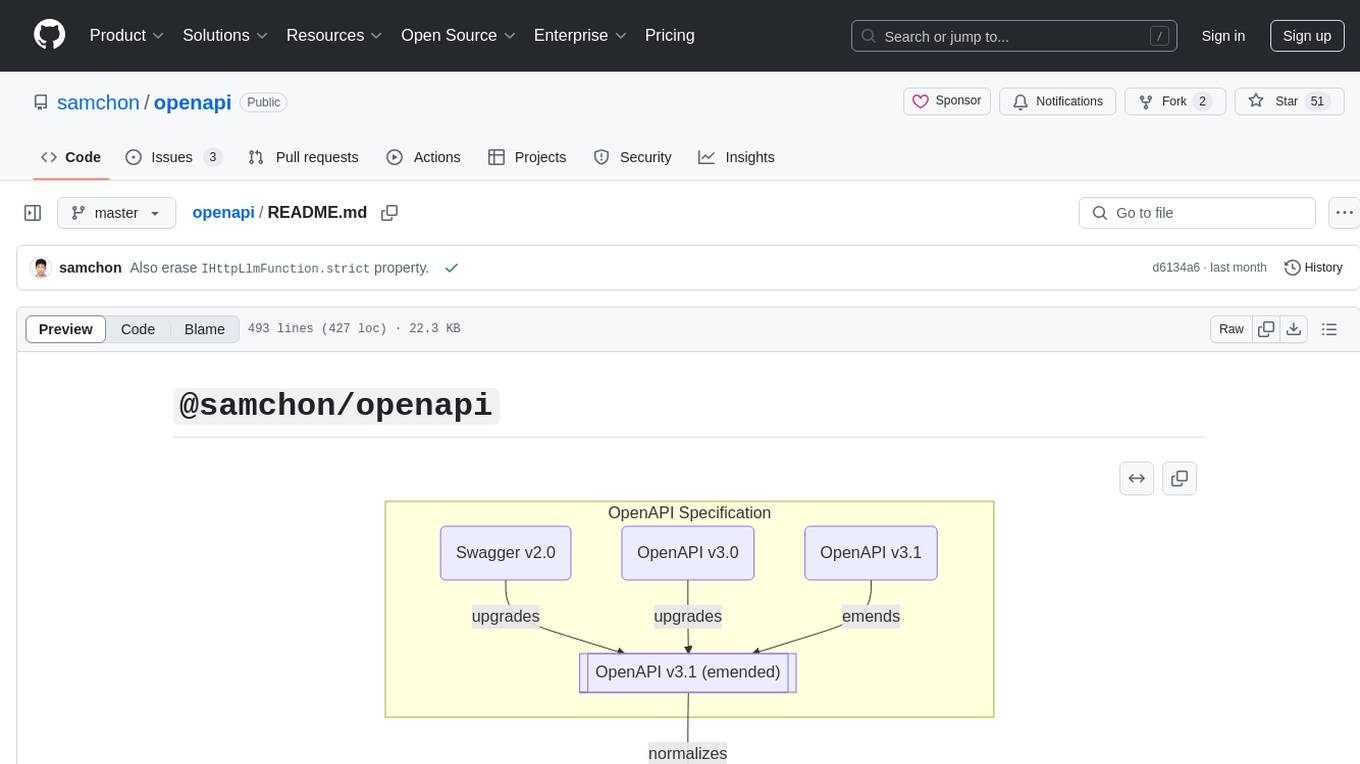
openapi
The `@samchon/openapi` repository is a collection of OpenAPI types and converters for various versions of OpenAPI specifications. It includes an 'emended' OpenAPI v3.1 specification that enhances clarity by removing ambiguous and duplicated expressions. The repository also provides an application composer for LLM (Large Language Model) function calling from OpenAPI documents, allowing users to easily perform LLM function calls based on the Swagger document. Conversions to different versions of OpenAPI documents are also supported, all based on the emended OpenAPI v3.1 specification. Users can validate their OpenAPI documents using the `typia` library with `@samchon/openapi` types, ensuring compliance with standard specifications.
SwiftAgent
A type-safe, declarative framework for building AI agents in Swift, SwiftAgent is built on Apple FoundationModels. It allows users to compose agents by combining Steps in a declarative syntax similar to SwiftUI. The framework ensures compile-time checked input/output types, native Apple AI integration, structured output generation, and built-in security features like permission, sandbox, and guardrail systems. SwiftAgent is extensible with MCP integration, distributed agents, and a skills system. Users can install SwiftAgent with Swift 6.2+ on iOS 26+, macOS 26+, or Xcode 26+ using Swift Package Manager.
openai-scala-client
This is a no-nonsense async Scala client for OpenAI API supporting all the available endpoints and params including streaming, chat completion, vision, and voice routines. It provides a single service called OpenAIService that supports various calls such as Models, Completions, Chat Completions, Edits, Images, Embeddings, Batches, Audio, Files, Fine-tunes, Moderations, Assistants, Threads, Thread Messages, Runs, Run Steps, Vector Stores, Vector Store Files, and Vector Store File Batches. The library aims to be self-contained with minimal dependencies and supports API-compatible providers like Azure OpenAI, Azure AI, Anthropic, Google Vertex AI, Groq, Grok, Fireworks AI, OctoAI, TogetherAI, Cerebras, Mistral, Deepseek, Ollama, FastChat, and more.
ivy
Ivy is an open-source machine learning framework that enables you to: * 🔄 **Convert code into any framework** : Use and build on top of any model, library, or device by converting any code from one framework to another using `ivy.transpile`. * ⚒️ **Write framework-agnostic code** : Write your code once in `ivy` and then choose the most appropriate ML framework as the backend to leverage all the benefits and tools. Join our growing community 🌍 to connect with people using Ivy. **Let's** unify.ai **together 🦾**

ivy
Ivy is an open-source machine learning framework that enables users to convert code between different ML frameworks and write framework-agnostic code. It allows users to transpile code from one framework to another, making it easy to use building blocks from different frameworks in a single project. Ivy also serves as a flexible framework that breaks free from framework limitations, allowing users to publish code that is interoperable with various frameworks and future frameworks. Users can define trainable modules and layers using Ivy's stateful API, making it easy to build and train models across different backends.
react-native-rag
React Native RAG is a library that enables private, local RAGs to supercharge LLMs with a custom knowledge base. It offers modular and extensible components like `LLM`, `Embeddings`, `VectorStore`, and `TextSplitter`, with multiple integration options. The library supports on-device inference, vector store persistence, and semantic search implementation. Users can easily generate text responses, manage documents, and utilize custom components for advanced use cases.
For similar tasks

nb_utils
nb_utils is a Flutter package that provides a collection of useful methods, extensions, widgets, and utilities to simplify Flutter app development. It includes features like shared preferences, text styles, decorations, widgets, extensions for strings, colors, build context, date time, device, numbers, lists, scroll controllers, system methods, network utils, JWT decoding, and custom dialogs. The package aims to enhance productivity and streamline common tasks in Flutter development.
For similar jobs
Protofy
Protofy is a full-stack, batteries-included low-code enabled web/app and IoT system with an API system and real-time messaging. It is based on Protofy (protoflow + visualui + protolib + protodevices) + Expo + Next.js + Tamagui + Solito + Express + Aedes + Redbird + Many other amazing packages. Protofy can be used to fast prototype Apps, webs, IoT systems, automations, or APIs. It is a ultra-extensible CMS with supercharged capabilities, mobile support, and IoT support (esp32 thanks to esphome).
generative-ai-dart
The Google Generative AI SDK for Dart enables developers to utilize cutting-edge Large Language Models (LLMs) for creating language applications. It provides access to the Gemini API for generating content using state-of-the-art models. Developers can integrate the SDK into their Dart or Flutter applications to leverage powerful AI capabilities. It is recommended to use the SDK for server-side API calls to ensure the security of API keys and protect against potential key exposure in mobile or web apps.
visionOS-examples
visionOS-examples is a repository containing accelerators for Spatial Computing. It includes examples such as Local Large Language Model, Chat Apple Vision Pro, WebSockets, Anchor To Head, Hand Tracking, Battery Life, Countdown, Plane Detection, Timer Vision, and PencilKit for visionOS. The repository showcases various functionalities and features for Apple Vision Pro, offering tools for developers to enhance their visionOS apps with capabilities like hand tracking, plane detection, and real-time cryptocurrency prices.
gemini-pro-vision-playground
Gemini Pro Vision Playground is a simple project aimed at assisting developers in utilizing the Gemini Pro Vision and Gemini Pro AI models for building applications. It provides a playground environment for experimenting with these models and integrating them into apps. The project includes instructions for setting up the Google AI API key and running the development server to visualize the results. Developers can learn more about the Gemini API documentation and Next.js framework through the provided resources. The project encourages contributions and feedback from the community.
Tiktok_Automation_Bot
TikTok Automation Bot is an Appium-based tool for automating TikTok account creation and video posting on real devices. It offers functionalities such as automated account creation and video posting, along with integrations like Crane tweak, SMSActivate service, and IPQualityScore service. The tool also provides device and automation management system, anti-bot system for human behavior modeling, and IP rotation system for different IP addresses. It is designed to simplify the process of managing TikTok accounts and posting videos efficiently.
general
General is a DART & Flutter library created by AZKADEV to speed up development on various platforms and CLI easily. It allows access to features such as camera, fingerprint, SMS, and MMS. The library is designed for Dart language and provides functionalities for app background, text to speech, speech to text, and more.
shards
Shards is a high-performance, multi-platform, type-safe programming language designed for visual development. It is a dataflow visual programming language that enables building full-fledged apps and games without traditional coding. Shards features automatic type checking, optimized shard implementations for high performance, and an intuitive visual workflow for beginners. The language allows seamless round-trip engineering between code and visual models, empowering users to create multi-platform apps easily. Shards also powers an upcoming AI-powered game creation system, enabling real-time collaboration and game development in a low to no-code environment.
AppFlowy
AppFlowy.IO is an open-source alternative to Notion, providing users with control over their data and customizations. It aims to offer functionality, data security, and cross-platform native experience to individuals, as well as building blocks and collaboration infra services to enterprises and hackers. The tool is built with Flutter and Rust, supporting multiple platforms and emphasizing long-term maintainability. AppFlowy prioritizes data privacy, reliable native experience, and community-driven extensibility, aiming to democratize the creation of complex workplace management tools.


